I put in breakwaters to help keep too much water from going up. I also put in a seismic sensor so that the people could be warned earlier. I placed sand dunes and trees to protect shelters from wind and water. Below you can see where I bulit shelters and a hospital on high ground so they would be out of the way of flooding waters.
My Results:
69 people dead, 69 people injured. Everything built up on high grounds remained safe. Everything on higher ground stayed in tact but the less sturdy houses on lower ground were destroyed.
You can see in the picture below how earth quakes and plate boundaries have a strong positive correlation. The brown dots represent earthquakes while the redlines are the plate boundaries. Earthquakes are often caused by the shifting of plates.
From Assignment 2, below is my hazards map. It describes the susceptibility of landslides throughout the US.
The map below has dots representing earthquakes by magnitude. The map is also color coded by shaking in areas. You can see how the two subjects correlate.
Below you can see liquification represented by Green(moderate), yellow(high), and red(very high). The dark blue areas show the places with most damage.
Below is a map showing the Peak Ground Acceleration. The lighter color is higher. You can see that higher PGA makes for more damage (the purple color).
Below is a world map along with plate boundaries and dots representing volcanoes. The countries in red are the 5 countries with most eruptions. Those are Indonesia, USA, Japan, Russia, and Italy. Notice that each of these countries surround the Pacific plate.
Below is a DEM of Mt. Rainier. DEM stands for digital elevation model; this show elevation in an area using color.
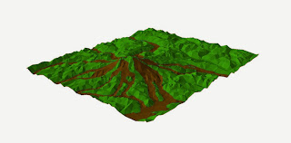
Below is a TIF (Triangular Irregular Model). Using geometric shapes you are able to see elevation three-dimensionally.
Other layers can be put laid on top on a TIF to show how it works within the feature. Below is an example of Lahars (Mudflow) in comparison with the land. Seeing it in 3-D makes the flow more understandable with how it works with the land.
Below: To the right is an image of Mt St Helens before the eruption and to the right is an image of the mountain after.
The photo Below shows the total loss of material that had been displaced to other places.
Below shows Landslide susceptibility in the USA. The red areas are the most prone and usually have nearby mountains have usual wet seasons.
Below shows doppler radar indicating precipitation measurements in certain areas.
Below shows the TIN of UWEC and everywhere in the light blue would be underwater in our 100 year flood event.
Below I was able to take data from a DEM of Eau Claire and find what a flood would look like at 800 feet. As you can see, the entire campus and much of the student housing would be completely under water.
Below shows the facilities in the flood zone.
Below shows the areas prone to flooding in the purple. The darker sections of that is where the higher densities of population are.


No comments:
Post a Comment